Symbols are compound objects that you can create from basic components and parameterize by adding properties. Typical uses of symbols include:
The following video demonstrates the basics of defining symbols.
To create a symbol:
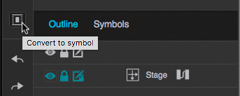
Shortcut: Click the Convert to Symbol button in the right sidebar, as shown in the following figure:
To verify that the symbol is created, check the Symbols tab, which in the lower right corner of the Solution Builder main window. After the symbol is created, you can delete the group from the main window.
To edit a symbol, right-click it in the Symbols tab and choose Edit. A small layout dialog containing the symbol is displayed. Make your changes and click OK.
To dynamically change the appearance of symbols or the data that they display, you can add properties to symbols and bind them to properties of the components. To add properties to symbols, perform the following steps:
The following video shows how to bind a symbol parameter to a property of one of its components.
Options for symbol parameters are as follows:
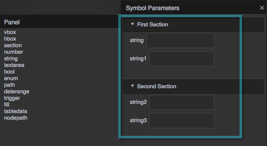
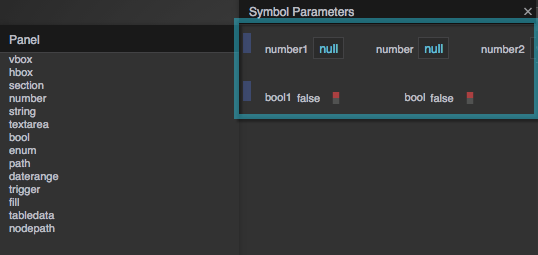
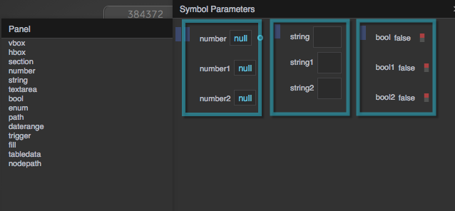
To control how a symbol's properties are displayed in the Property Inspector, you can add sections, rows (hboxes) and columns (vboxes) as shown in the following figures
Symbol definitions are stored in .dg5 files, which define a single page in a project. To associate a symbol with a component that uses it (for example, to specify the symbol to be used as a marker on a map layer),
set the component's Symbol property to a path pointing to the symbol definition, omitting the .dg5 extension. If the symbol is defined on the page where
you are using it, simply specify the name of the symbol. If the symbol is located in the project's palette folder, the path syntax is
palette/[subfolders, if any]/[page name]:[symbol name]. When specifying the page name, omit the .dg5 extension.
For example, the correct path for a symbol named "mySym" that is defined in the palette/widgets.dg5 page is palette/widgets:mySym.
If the symbol is defined in a project that was imported into the currently-open project's lib folder, the path syntax is
lib/[project]/palette/[subfolders, if any]/[page name]:[symbol name].
For example, the correct path for a widget named "Fan East" that is defined in a page named Equipment.dg5 in the imported project named "HVAC" is
lib/HVAC2/palette/Equipment:Fan East.
A typical use for a symbol is to implement callouts. A callout is a small component that identifies or provides additional information about a component that is displayed in a layout. Callouts are implemented by associating the component with a symbol that is configured to display the desired information, either statically or when a user action such as clicking or mouseover triggers display. Callouts can also be used to create other effects, such as drop-down menus and pop-up dialogs.

To create a simple static callout for a single object, create a symbol with the desired content and styling and configure the objects Callout properties to display the symbol as desired. The following brief video shows you how.
To control when a callout is displayed and hidden, you bind its Show Trigger and Hide Trigger properties to the desired events. For example, to create a callout that is displayed when the user clicks a component and hidden when the user clicks its Close button, perform the following steps
First define the symbol that will be displayed as a callout.
Next, create an image component and configure its Callout properties to display the callout when the user clicks the image and to hide the callout when the user clicks the Close button, as follows:
Go into Preview mode and verify that the callout displays when you click the image component and is hidden when you click the callout's Close button. The following video illustrates the process.
Return to Atrius Developer Portal Home Page